


About the project
The site must appropriately combine winter and summer versions through an easily discoverable button in the header and the main menu. Photos and videos should be combined with useful information that visualizes and emotionally impacts users, bringing to the fore the beauty of the mountain, action, adventure, peace and comfort in the resort.

Brief
01To build a design that
is modern and stylish. It loads quickly and is optimized for mobile devices. It is flexible and allows changing the sequence of elements (widgets) as well as the order of menus. The main goal is the presentation of opportunities for rest, accommodation, catering and all other provided tourist services in the internet space
Problems
02The main problem is the need for modernization and an easy way to provide services to users.
Design
03


Site map
Icons
The icons are custom developed, as clean as possible with clear and readable graphic signs. It is also a graphic accent to the large photographs on the site.
Colors

Font

functionalities
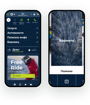
The site provides the necessary information in real time about the weather conditions, as well as the current snow cover in the area, and gives a quick and easy opportunity for online reservation.

Menu
The navigation is static (frozen) with an integrated main menu (it does not hide when scrolling down the page). The bar with large photos and text changes different information every few seconds.
SUMMER VERSION
The Summer/Winter division is of extreme importance for the project, as the two seasons imply completely different services and activities to be communicated to the user. The implementation of this division happens with a button to switch between the two versions.

WINTER VERSION

Inner pages
The inner pages of the site are arranged to give the information that needs to be communicated as interestingly as possible and are formed so that the user can easily scan the entire content.

Responsive design
The site is optimized with a responsive design that adjusts to fit the size of any device.
