

About the client
Cash Credit is a high-tech non-bank financial institution,
Cash Credit is motivated and always strives for innovation, opportunities to automate processes that waste their time to pay attention to individual aspects of lending.
They strive to create and offer products unknown to the Bulgarian market that are truly useful for their users.
-
15

Months
Hard work to build the overall vision
-
95

Screens
With a unique design based on the results of UX tests
-
457

Coffees
Drunk during work


Brief
To improve the design identity and improve the usability of the site
In addition to the general feeling in the site for clarity and cleanliness, we want there to be playfulness - a friendly feeling for products that are inspired by our users.

Problems
-
Our current navigation needs improvements to follow the logic of our products.
-
Our new products require other functionalities and controls in the calculators.
-
For the long-term sustainability of our site, we need a large set of dynamic content sections.
Colors


Font

Site Map
In the new navigation, we focused on several things: user paths to have a clear beginning and be distinguished by meaning - services, additional information and profile management in Cash Credit.

Design
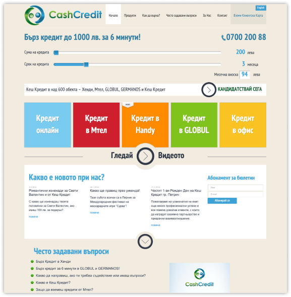
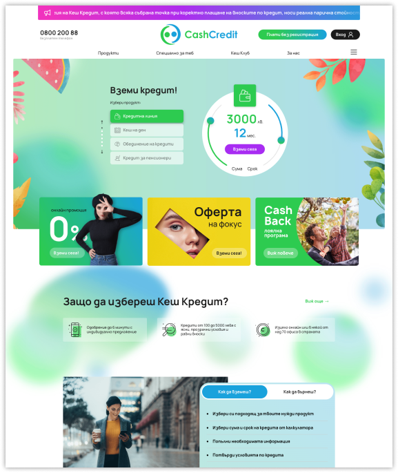
Our approach with the home page was to get rid of heavy photos and visuals that rather defocused from navigation and the use of calculators for different products. The menu is also purposefully white to ensure readability for all users.


Our work with Cash Credit dates back a long time and we have been partnering with them since way back in 2014

Cash Credit has been on the Bulgarian market for many years. And that means tradition
You will also see down in the progress of the home page that there are elements that are constant, and those that have dropped out in the natural development of the business.

The big refresh of the site with new technologies
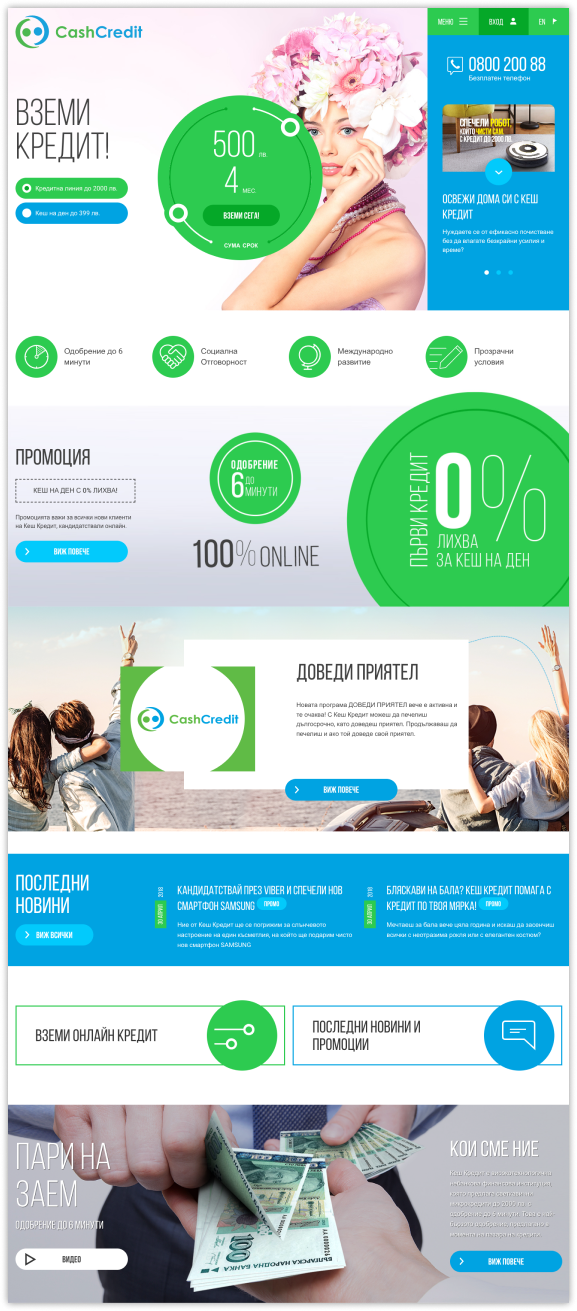
With the development of technology, we could use more photos and diverse elements. Here we introduced an innovative way to communicate promotions - the column on the right, which is also a carousel.
On the inner pages, the calculator is sticky on the right and expands across the width of the site.

Over time, the needs for vision and function changed
Readability and access to digital services by people with disabilities is becoming increasingly important and represented in our work. That's why we did a lot of tests for contrast and readability, and added very clear hovers and clickability indicators.
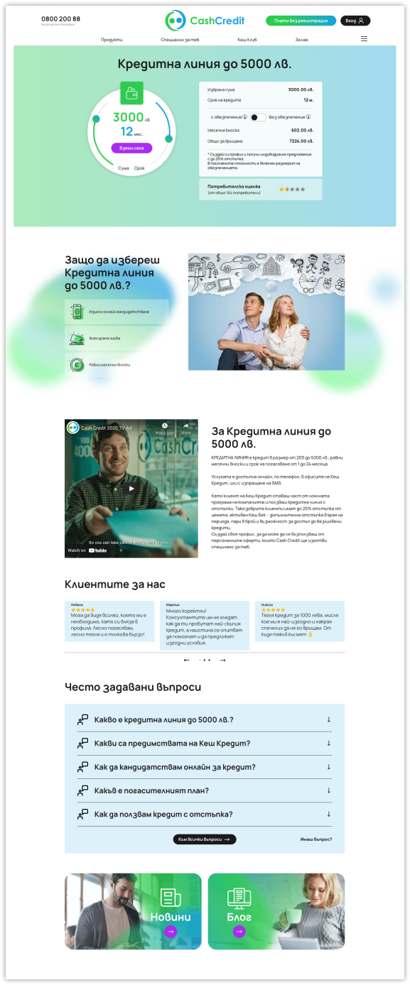
On the financial product page, information is most important
In addition to the transparency of the product conditions, it was very important to unfold in an understandable form reasons, explanations, additional information, as well as feedback from other customers.
For Cash Credit, it was very important that the people who use their site are sure that they are applying for the most suitable product for them.
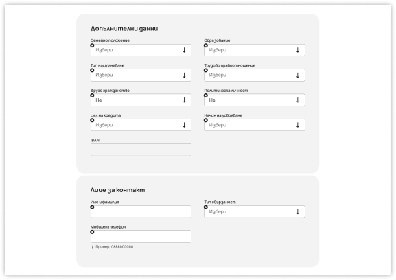
We also paid special attention to the form fields
We know that graphic designs work only as far as users can complete their path. And that doesn't happen without the good old input fields.
That's why we invested in the development of fields and micro-animations, hovers and element states.

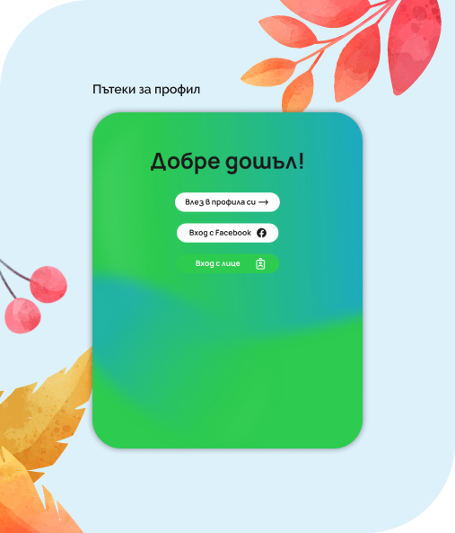
We combined the profile paths into one screen for complete ease
Cash Credit creates products for diverse target groups and aims for equal understanding and orientation in their sites.
In addition to the classic login form, we developed login with the popular Facebook platform, as well as face login.

Botyo
the chat bot
Our favorite assistant is Botyo, whom we decided to update and show in a new and polished look. We also created a "on break" version for him to take a nap too.


Responsive design


Landing campaign
The landing campaign for Cash Credit's birthday was our favorite project and we had a lot of fun while creating the game together with their team.
Our goal was to create a party if it were a web page. In the process, we decided that part of the fun was to make a survey, which at the same time communicates the key good and valued aspects of Cash Credit's products.
