About the client
ORANGE CENTER is the first chain of stores of its kind, offering books, music and video products, stationery and office supplies all in one place. The large retail space of the stores, combined with the "Books, Music, Stationery" mix and concept, make the chain a unique commercial undertaking in Bulgaria, integrating the modern spirit and culture of society.

-
Months
Intensive work for
building the
overall visual identity -
Screens
With a unique design
based on UX testing
results -

Tests
Conducted during
project work
Brief


Problems
The main issues to optimize are:
- We provide distribution of book products from the UK. The volume of these products is hundreds of thousands and they are uploaded with images from the source that are much smaller and unrepresentative. We need to determine how to handle this on the product page.
- Campaign, branding and category landing pages — create a homogeneous structure and a set of elements to be used to build various landing pages that can be arranged dynamically according to the team's needs.
- Product and category banners — make them dynamic and allow easy maintenance and replacement by the internal team.

Colors

Font
When we met with the Orange Center team, we knew the site needed not only a Cyrillic-capable font but one with character and readability. We turned to Typedepot's portfolio and immediately fell in love with the Moreno typeface.


Color Coding
To bring life and dynamism to the site, we created functionality in the admin to change the color of the main category tile so it harmonizes with the slider banner. Contrast checks are required to ensure accessibility.

Search
We placed a prominent search bar at the top to facilitate precise searches. We also developed suggestions that appear after typing a term, by product, category and all possible results.

Listing page
The architecture of the listing page required flexibility due to differences in product categories with nested levels. We highlighted them on the left and provided spaces for small banners for cross-selling.

Mobile filtering
Given Orange Center's complex product categorization, we implemented step-by-step filtering with a clear hierarchy and a results counter to indicate when users should stop filtering.


Design
We organized the homepage structure around several key goals for content visualization:
– First slide: Clear search and cart, prominent open navigation, easy access to phone and locations button. Distinct campaign look;
– Second slide: wide campaign banner with featured products;
– Product sliders;
– Author of the month section;
– Grid with directing banners.

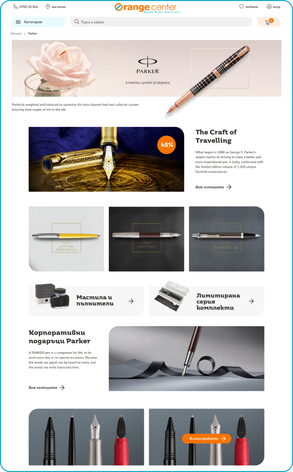
Product page
On the product page we applied a classic and clean approach so every item looks convincing and its attributes are clear and readable.

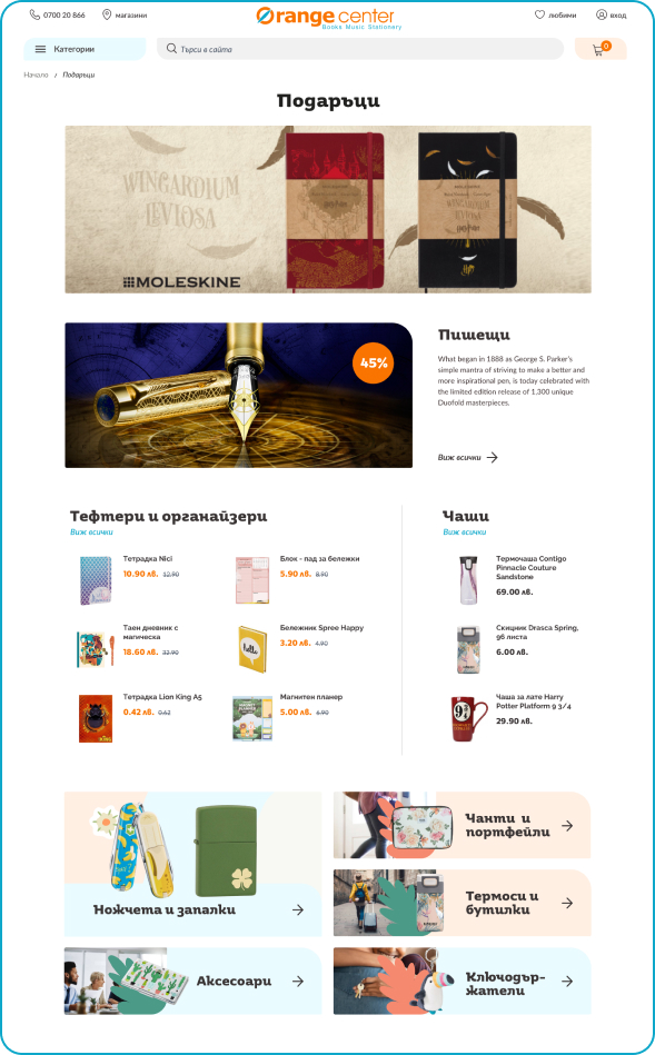
Landing pages
A recognizable quality of Orange Center is brand and franchise collections. We developed dynamic banners and components that can be freely arranged by the administration.

Other landing pages