
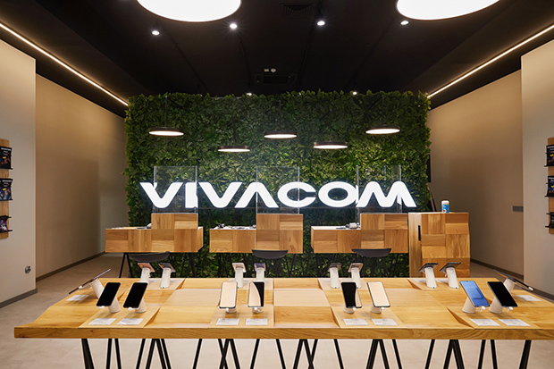
About the client
Vivacom is an operator offering a broad range of telecom solutions for private and business customers — mobile and fixed voice services, fiber internet, satellite and next-generation interactive TV, as well as tailored solutions for corporate clients. The company develops innovative services in IoT and smart city technologies.
Brief
Build a design identity and improve the site's usability
Create a user-friendly site that provides customers quick and easy access to services and information, while ensuring a seamless experience across devices.

Problems
Colors
The colors are contrasting and split into primary and secondary palettes.
Font
The font used is Manrope.
We chose a clear typeface with sufficient spacing, conveying a sense of lightness and professionalism.

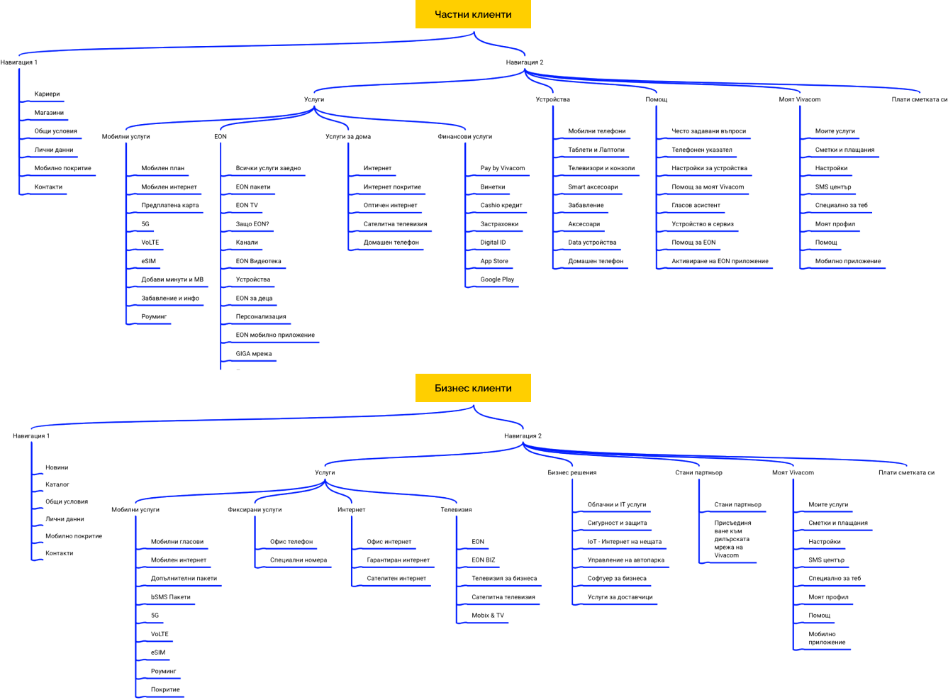
Site map
We focused on a few things: user journeys that have clear entry points and are separated for private and business customers.
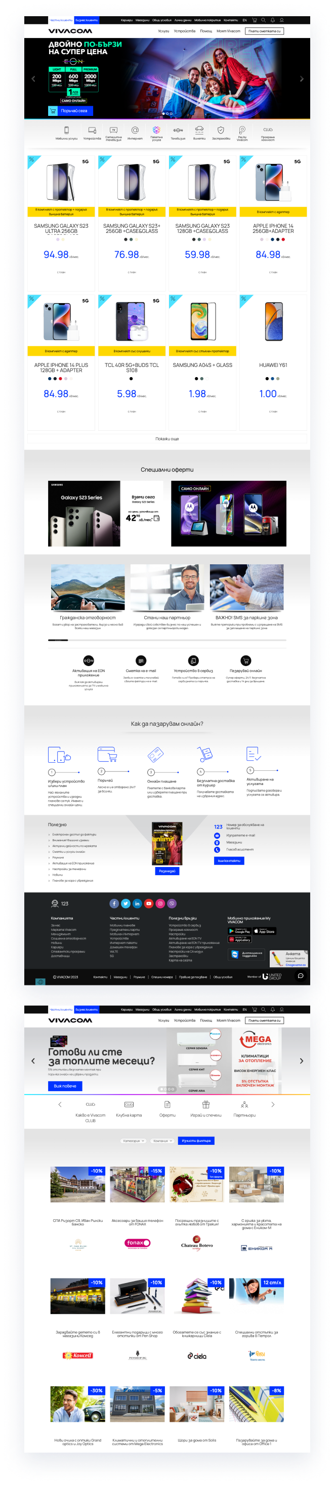
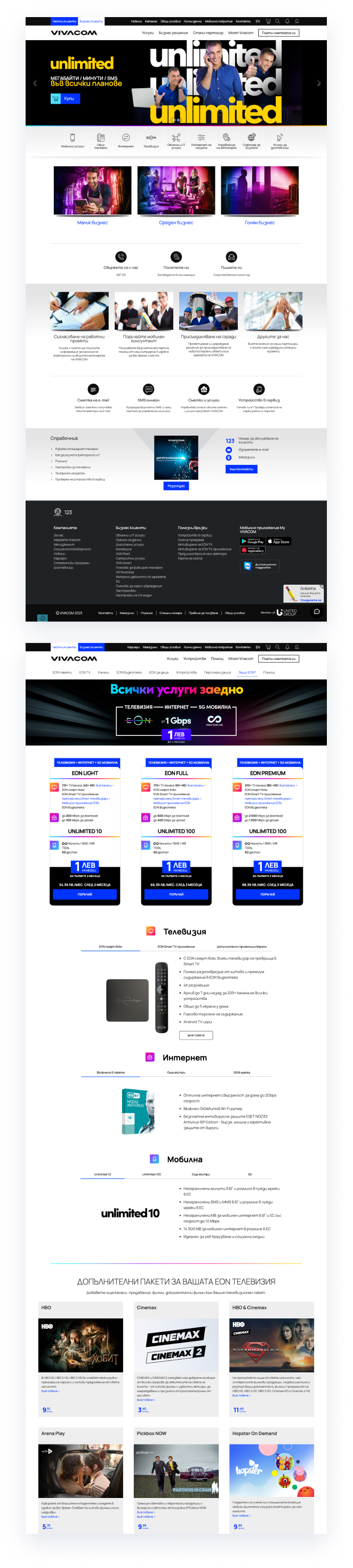
Design
The new design is modern, engaging and user-friendly, improving the brand's online presence. The design was updated with a new color scheme and typography aligned with Vivacom's branding.
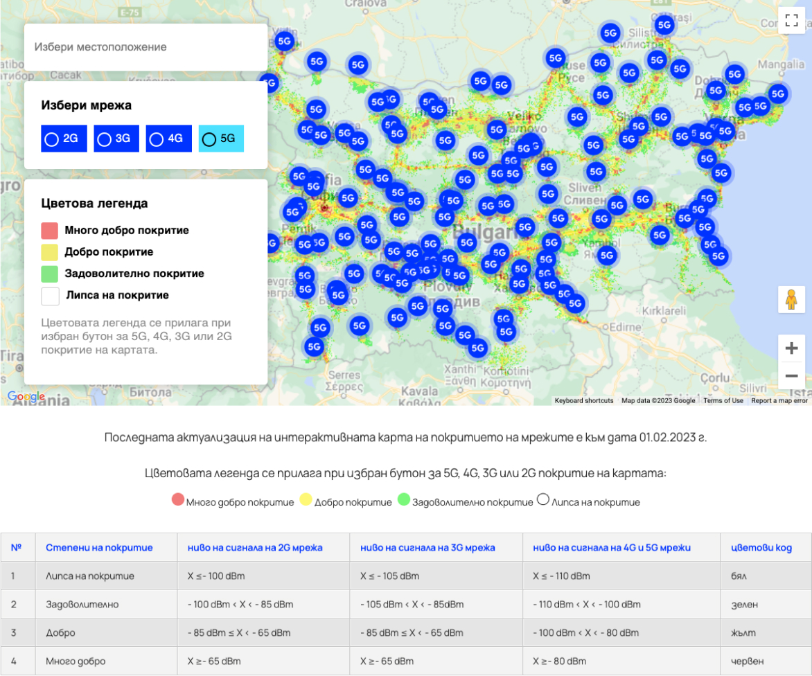
Functionality — Vivacom coverage map for 5G, 4G, 3G and 2G in Bulgaria
Vivacom continues to invest and develop its infrastructure to provide 5G network coverage across the country for a premium user experience.
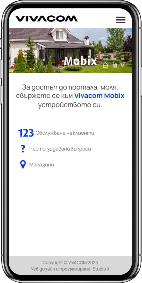
Vivacom Mobix
4G internet access, easy and convenient service management, location switching capability, options to add extra MBs and unlimited internet offers.
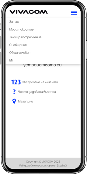
Responsive design
The site is accessible and easy to use on both desktop and mobile devices, providing a seamless user experience.
